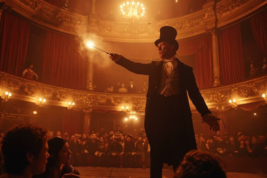
Theposter of a magic show plays a crucial role in attracting the public. It’s the first impression potential spectators will have of your show. A well-designed poster can make the difference between a full house and empty seats. Let’s discover together the secrets of creating a magical poster that will captivate your audience from the very first glance.
Key elements of a successful magic show poster
To design a striking magic poster, it’s vital to understand the components that make it effective. A successful poster must not only inform, but also intrigue and seduce the target audience. Here are the essential elements to integrate:
- A catchy title
- A striking image or illustration
- Practical information (date, venue, schedule)
- The name of the magician or troupe
- A slogan or catchphrase
The title of the show should be evocative and mysterious. It can refer to the world of magic, such as “L’Illusion Suprême” or “Les Secrets de l’Impossible”. Thecentral image is crucial: it must represent the essence of your show. Choose a photo of the magician in action, an object emblematic of magic (hat, wand, cards), or a surreal illustration evoking wonder.
Practical information should be clearly legible, without dominating the poster. Use elegant but legible typography for the name of the artist or troupe. Finally, a catchy slogan such as “Prepare for the incredible” or “Magic like you’ve never seen it before” can enhance your poster’s appeal.
Choosing the ideal color palette for your magic poster
The color palette of your poster plays a decisive role in its visual impact. Colors evoke specific emotions and associations, so it’s crucial to choose them wisely. For a magic show, certain combinations are particularly effective:
| Combination | Effect | Example of use |
|---|---|---|
| Black and gold | Elegance and mystery | Black background with gold details |
| Purple and silver | Magic and enchantment | Violet elements on silver background |
| Red and white | Dynamism and contrast | Red text on white background |
Black is often associated with mystery and elegance, making it a popular choice for magic posters. Combined with gold, it creates a luxurious and intriguing atmosphere. Purple, a color traditionally associated with magic and the supernatural, can be used to evoke enchantment.Silver adds a touch of sophistication and shine.
Don’t forget that contrast is essential for legibility. A poster that’s too dark or too light can make the text difficult to read, especially from a distance. Test different combinations to find the one that best enhances your message and catches the public eye.

Incorporate magical visual elements to captivate attention
To create a truly captivating magic show poster, it’s vital to incorporate visual elements that immediately evoke the world of magic. These elements must not only attract attention, but also give a foretaste of the experience the audience will have during the show. Here are some ideas for visual elements to consider:
- Optical illusions: Incorporate patterns or images that play with the spectator’s perception.
- Magical symbols: Use stars, spirals or mysterious geometric shapes.
- Magician’s props: depict flying cards, a hat with a rabbit sticking out of it, or a sparkling magic wand.
- Light effects: Add rays of light, sparks or mysterious glows.
- Enigmatic silhouettes: Create mystery with shadows or partially revealed silhouettes.
The use of these elements should be subtle and harmonious. An overloaded poster can lose its impact. The aim is to create a magical atmosphere while keeping the composition clear and legible. Draw inspiration from the great names of magic, such as Harry Houdini or David Copperfield, whose posters have left their mark on the history of the show.
To add a modern touch, consider using holographic or augmented reality effects. These technologies can transform a simple poster into an interactive experience, offering a taste of the magic to come. Imagine a poster that, when scanned with a smartphone, reveals an animated illusion or a secret message from the magician.
Optimize the distribution of your magic poster
Once your magic show poster has been created, it’s essential to distribute it effectively to maximize its impact. The distribution strategy must be as carefully planned as the design of the poster itself. Here are a few tips for optimizing the visibility of your poster:
Choose poster locations strategically. Places frequented by your target audience are crucial. For a magic show, consider :
- Theaters and concert halls
- Magic schools and specialty stores
- Local cafés and restaurants
- Shopping malls and high-traffic areas
- Libraries and cultural centers
Adapt the format of your poster to the locations available. Prepare different sizes, from large formats for urban billboards to flyers for local distribution. Don’t forget the digital version for social networks and websites.
Use digital marketing to amplify the reach of your poster. Share it on social networks, create Facebook events, and use relevant hashtags like #SpectacleDeMagie or #MagieEnScène. Collaborate with local influencers or magic enthusiasts to increase online visibility.
Finally, don’t hesitate to organize promotional actions around your poster. A photo contest in which participants are asked to pose with the poster can generate an interesting buzz. You can also create signed collector’s versions to distribute at special events, reinforcing the appeal of your show.
By combining creative design and strategic distribution, your magic show poster will become a genuine communication tool, capable of turning public curiosity into sold tickets. Remember that the poster is often the first contact between your show and your potential audience. Make it as magical as the show it advertises!

